
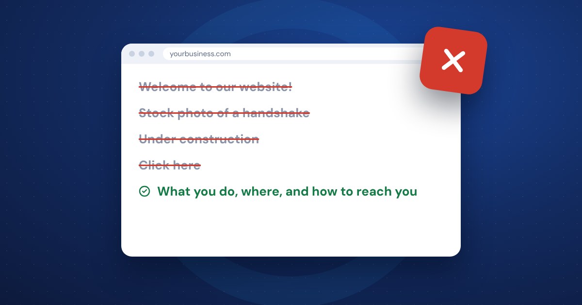
Most small business websites don't lose customers because of what's missing. They lose them because of what's in the way: pop-ups, slow images, old news, and a phone number nobody can find. Take those out and the same site will usually work better without a redesign.
Anything that blocks the first few seconds
Visitors decide very quickly whether to stay. Don't spend those seconds making them wait or click something away.
- Autoplay sound or video with sound. People browse at work, in waiting rooms and in bed next to someone sleeping. If your site makes noise without asking, many will close it.
- Pop-ups that appear the moment the page loads. Nobody wants your newsletter before they know what you sell. If you use a pop-up, show it after someone has read a while, make it easy to close, and don't let it cover the whole screen on a phone.
- Intro pages, loading animations and "click to enter" screens. They add a step between the visitor and what they came for.
- Huge sliders on the home page that rotate through five messages. Most people see the first one. Pick your best message and put it there.
Oversized photos and too many extras
A slow site costs you customers, and it can hurt how you show up in Google. Common causes:
- Photos uploaded straight from a camera or phone. Resize and compress them before they go on the site. You can usually cut the file size a lot without anyone noticing a difference.
- Images with no description. Add short alt text that says what the photo shows. It helps people using screen readers and helps search engines understand the page.
- Too many plugins, widgets, chat bubbles, tracking scripts and social feeds. Each one adds weight. If nobody uses it, remove it.
- Background videos that look great on a fast office connection and crawl on a phone with two bars.
Old news and dead ends
Nothing tells a visitor "this business might be closed" like an events page from three years ago. Watch for:
- "Latest news" that isn't.
- A copyright year in the footer that's several years behind.
- Old prices, staff who have left, or services you no longer offer.
- Pages that say "coming soon" and never came.
- Broken links and images that show as blank boxes or "page not found".
Set a reminder to review the site every few months. Click every menu item, check your hours and run a free broken link checker. If keeping it current never happens, that's what website maintenance is for.
A hidden phone number
Some sites make customers dig for contact details, or offer only a contact form. Make it easy:
- Put your phone number at the top of every page, and make it tappable on phones.
- Show your service area or address, and your hours.
- Keep your contact form short. Name, phone or email, and a message is usually enough.
- Don't make people create an account just to ask a question.
- If you use a chatbot, make sure a real person follows up.
Writing that makes you look careless
Your website is often the first conversation a customer has with you. Things to avoid:
- Typos and grammar mistakes. Read it out loud, or have someone else read it.
- Industry jargon your customers don't use. Write the way you'd explain it on the phone.
- Long blocks of text with no headings. Break it up so people can scan.
- ALL CAPS and lots of exclamation points. It reads like shouting.
- Light gray text on a white background, or text over a busy photo. If it's hard to read, people won't.
- Content written by AI and published without anyone checking it. It's fine to use tools to help, but read every word and make sure it's accurate and sounds like you.
Clutter that pulls people away
Every link you add is another way out. Be careful with:
- Ads for other businesses. Unless your site is a publication, they make you look less established and send visitors elsewhere.
- Social media icons for accounts you haven't posted on in a year. Link only to the ones you keep up.
- Blog comments you don't moderate. Spam comments make the whole site look abandoned. Moderate them or turn comments off.
- Too many menu items. Keep the main menu to your most important pages and put the rest in the footer.
- Stock photos that clearly aren't your team, your work or your town. Real photos, even simple ones, build more trust.
Not checking it on a phone
Many owners only ever look at their site on a desktop computer. Many visitors don't. Pull your site up on your own phone and try to do what a customer would: find a service, check your hours, call you. If anything is hard, fix that first. If the problems go deeper than a cleanup, a website redesign may make more sense than patching.
The short version
- Remove anything that blocks or delays the first look: autoplay sound, early pop-ups, intro screens.
- Shrink photos and cut plugins and widgets you don't use.
- Update or delete old news, prices, staff and broken links.
- Put your phone number on every page and make it tappable.
- Test the site on your phone the way a customer would.